| » Forum Index » The Friday Challenge » Topic: Contest 237: Build me a banner |
|
Posted on 26/02/09 12:16:14 PM |
|
josephine harvatt
Gag Gadgeteer Posts: 2605 Reply |
Re: Contest 237: Build me a banner

Sexy !!! _________________ I'm not really bad - I just draw that way |
Posted on 26/02/09 2:01:03 PM |
|
Pete
Body Booster Posts: 121 Reply |
Re: Contest 237: Build me a banner
tooquilos, I love the reveal at the end of the dance... even if i do find it all slightly disturbing! very funny.
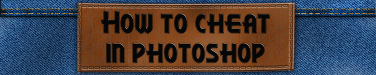
My entry... I think I lost the clarity of the HTCIP logo because of all the different graphics of the book covers (something I remember Steve warning about in the Art & Design in Photoshop book). 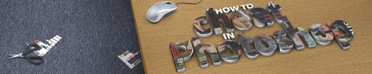 |
Posted on 26/02/09 2:33:22 PM |
|
Swade
* Posts: 19 Reply |
Re: Contest 237: Build me a banner
I more or less thought the reader's gallery was for work you were really proud of... and i dunno yet if i'll be proud of my banner 
Cheers Swade |
Posted on 26/02/09 2:46:47 PM |
|
Pete
Body Booster Posts: 121 Reply |
Re: Contest 237: Build me a banner
Higher res version with render from Cinema 4d I used to start the project here http://www.flickr.com/photos/pikuseru/3311876820/ |
Posted on 26/02/09 3:14:12 PM |
|
GKB
Magical Montagist Posts: 4155 Reply |
Re: Contest 237: Build me a banner
Anna, That has to be one of the most disturbing things I've ever seen in HTCIP! Excellent. Welcome back to the fold. _________________ Why didn't Noah swat those two mosquitoes when he had the chance? |
Posted on 26/02/09 7:05:12 PM |
|
Deborah Morley
Makeover Magician Posts: 1319 Reply |
Re: Contest 237: Build me a banner
Wasn't sure whether to post this, but Friday wouldn't be the same without a comment good or bad!  |
Posted on 26/02/09 9:10:12 PM |
|
steve hill
Brain Basher Posts: 228 Reply |
Re: Contest 237: Build me a banner
think thats going to give me nightmares anna lol  |
Posted on 26/02/09 9:15:47 PM |
|
james
Surreal Spoofer Posts: 1194 Reply |
Re: Contest 237: Build me a banner
Deborah! I don't recall your work being other than first class. |
Posted on 27/02/09 08:38:42 AM |
|
Steve Caplin
Administrator Posts: 7169 Reply |
Re: Contest 237: Build me a banner
We've certainly had plenty of useable entries this week - enough for several months of rotating banners. I'm going to give one week each to the best of them. Thanks for all the effort! Because these are going to represent the forum (and the book) to the outside world, I'm going to be more demanding than usual, and may ask for a few changes... First up was GKB, with the Superman figure from some months back. I love the flare effect on the lettering, which creates a beautiful impression. My only issue here is with the Motion Blur on Superman himself, which seems a little detached from him. Either add a lot more of it, so it's longer and it blends into him (his left side needs to be blurred, rather than crisp) or remove it altogether. VERDICT: Fix this and it's one for the banner series! I liked the speed effect of Lexus' entry, and the second entry is a great improvement. This one does what a banner needs to do - gets the message across quickly and simply. What I'd really like to see here, though, is the red streak going in front of the sign rather than behind it: I think this would tie the two elements together better. VERDICT: Bring the streak forwards and I'll use it. A great entry from damir: good treatment of the lettering, I like the gold effect, and the Ace tucked up the sleeve is excellent. VERDICT: No changes needed - this one's good to go. An interesting approach from mguyer, which would be great if it were the right shape and size! Aha - fixed in the second entry. Good texture on the lettering, but it seems a little flat on the surface: a very small amount of Spherizing would fix this one. VERDICT: Bulge the text slightly, and it's a goer. A multi-layered, complex entry from Luis that's eye-catching and entertaining. I think three turned corners may be two too many - and aren't the corners too big for their spaces? - but otherwise this is spot on. VERDICT: Fix the corners, if you like - but I'll use it anyway. Beautiful, textural work from Stefan: I love the faded paint approach. This is one I could look at for hours. VERDICT: Good to go. A very graphic approach from Paul2007. I like the streak of paint, and it's a good strong colour. My only concern is that the bevel on the lettering is just too deep: change it if you like, but I could live with it. I like the clever reworking of the CS4 logo in the second entry! VERDICT: They're both in. A neat idea from Nick Curtain - do I need to get into junk mail distribution, do you think? I like the shape and position, and the paper works well. A little confused by the stone letterbox, though: aren't these things usually made of brass? I love the caterpillar approach in the second entry - excellent lettering! VERDICT: Fix the letterbox, and it's a goer. The caterpillar version is just right. A new member this week - and a fantastic first post from C@zzy. Excellent chalk effect on the board, very fine rendering of the cheat notes on the hand - and an extremely good idea to begin with. VERDICT: This one's ready to go. Welcome to the forum! A very graphic look from Ben Mills - I like the overlaid colours in the corner. Is the rainbow a little detached from the lettering, though? Bringing it in front would unify the whole thing, I think. The only think I don't like here is the underline, which cramps the logo. VERDICT: Lose the underline and it's in; experiment with the rainbow if you have time. A very personal entry from Josephine Harvatt. I like the colour shifts and the subtle toning of the 'reflections' - but as you should know by now, I'm far too shy to allow my face to appear 16 times at the top of the site! VERDICT: I like it, but I'd be too embarrassed to use it! Change the image of me for someone else, and it's in. Great simulation from Steve Mac - have you been taking lessons from Luis? I really like this one, although it might have been better if the button labels referred to Photoshop effects rather than audio equipment, don't you think? I like the lights in the second entry, though. VERDICT: Change the labels if you can be bothered, but this is good to go anyway. I don't quite understand all the references in gaoxiguo's entry, but there's a textural quality here that I like. The only problem is the logo, which is too cramped at the top of the box. But I love the second entry - beautiful! VERDICT: Move the logo down, and I'll use the first one; the second is perfect. (Trevor - you may need to translate some of this for Gaoxiguo, I'm not sure Google is up to it!) Another new member this week - and Les Moore has put together a solid, appealing banner. I like the listing of all the sections down the sides, and the shadow behind the lettering is great. My only issue here is with the books, that seem rather squeezed up: this often happens when perspective is applied. Stretch them both vertically - it doesn't matter if the bottoms are lost, they're covered by cloud anyway - and it will look perfect. VERDICT: Fix the books and it's in. Welcome to the forum, Les! A leaping whale from james - with a subtly changing time of day in the sea colours. I'm not sure if the forum software can accept animated GIFs, but I'll try it out! Interesting you should have chosen this approach - it's strikingly similar to the cover I designed for the new edition of How to Cheat in Photoshop Elements. VERDICT: I like it - but at 820K it's just too big to use! The act of creation from Daniel H - thanks to Michelangelo for the hand. A beautiful entry, that says it all. Perfect. VERDICT: Just right. I'm not sure new visitors to the site will get the Darwin reference in brewell's entry - but the 'cheating' aspect certainly comes across! Great lighting, and the man peering from behind the sign is excellent. My only issue here is with the perspective of the sign, which doesn't seem to match that of the window: any chance of a tweak here? VERDICT: Fix the perspective and it's in. A surprisingly straightforward entry from Tom - compiled from elements of the cover, though, this one does exactly what's required. I like the added sparkle! VERDICT: Spot on. A cute animation from maiden - great lettering distortion, and good 'pootling' on the new lettering! I'm not sure the second version of the logo is needed, though: and I'm a little embarrassed to see my name blazoned across the banner! VERDICT: Lose the second logo, and this is in! A fantastic ice effect from Cl&m&nt - but is it just too strong for us to be able to read the lettering? No, I think it does work. A ragged outline on the penguin, though - he needs some smoothing. VERDICT: Smooth the penguin, and it's good. More leaping killer whales, this time from Steve Hill. What is it about marine predators that appeals here? I like the shape, but the bevel effect on the lettering is too strong. Also, I'd try changing the stroke from black to white, which will make the text much more readable. VERDICT: Fix the stroke and bevel, and it's useable. Very enjoyable texturing from Wayne - this one has a well-worn look to it. The Reader's Forum lettering could be toned down a little, though: as it stands, it doesn't appear connected to the background texture. VERDICT: Lower the lettering opacity and it's good. A tasty animation from vibeke - a lot of work involved in this one! It is a shame how the quality is lost when we make this web-friendly, but I'm afraid there's really no alternative. Great work on the second entry. VERDICT: Yes, of course! Multiple stamps from Jeepy: simple, but rather effective. I like the subtle texture in the background. VERDICT: I can use this one. Some real magic from tooquilos: interesting use of extreme blurring to make the lettering appear out of the puff of smoke. I love this! You'll understand, of course, why I'm reluctant to use the second entry... VERDICT: This first one is in! Gorgeous, intricate work from Pete this week. I know there's an issue of clarity, but this one is just so exuberant - and so beautifully realised - that the clarity really isn't an issue. Stunning work. VERDICT: Love it. I really like Deborah Morley's entry - very cute bubbles. What I'd really like to see here, though, is one or two large bubbles in front of the lettering, with the sort of distortion we'd expect in such circumstances... but I understand if you can't be bothered to do this! VERDICT: It's in anyway - tinker with the bubbles if you have time. _____________________________ Fantastic work this week - I'm delighted with the results, they'll really liven up the front page of the site. Thanks to Cl&m&nt for the idea! I think these are going to look so good that I'm going to extend the series indefinitely. Which means that anyone, at any time, will be welcome to submit a banner and, if I like it, it will get its week's appearance on the front page. I've started a new thread in the Reader's Gallery for new and amended entries. Looking forward to what turns up! |
Posted on 27/02/09 08:59:45 AM |
|
josephine harvatt
Gag Gadgeteer Posts: 2605 Reply |
Re: Contest 237: Build me a banner
Steve - you shrinking violet ! _________________ I'm not really bad - I just draw that way |
Posted on 27/02/09 09:41:58 AM |
|
maiden
Golden Gif Gagster Posts: 471 Reply |
Re: Contest 237: Build me a banner
Awww leave the poor chap alone, he's shhhhyyyy lol
|
Posted on 27/02/09 10:20:55 AM |
|
GKB
Magical Montagist Posts: 4155 Reply |
Re: Contest 237: Build me a banner
Thanks Steve, Yes, I wasn't happy with the blur myself. It will be a few days before I can get the amended banner posted as I am back in Sweden for a while and the original file is at home. Some great banners from everyone. Gordon _________________ Why is there only one word for Thesaurus? |
Posted on 27/02/09 11:21:57 AM |
|
steve hill
Brain Basher Posts: 228 Reply |
Re: Contest 237: Build me a banner
thanks for th comments steve I wiil change it over the weekend |
Posted on 27/02/09 11:47:25 AM |
|
Steve Mac
Grunge Genie Posts: 539 Reply |
Re: Contest 237: Build me a banner
Thanks Steve. Funny you mention the effects. I had those layers made but didn't use them. I should start going with my instincts. |
Posted on 27/02/09 3:13:51 PM |
|
Wayne
Printers Devil Posts: 312 Reply |
Re: Contest 237: Build me a banner
Steve, the PC's in for repairs, and the original .psd file is on the desktop! I'll amend the banner as soon as I get it back and post it in the Reader's Gallery. (I'm working on a loan PC at the moment, so no Photoshop aaargh!) |
Posted on 27/02/09 7:16:00 PM |
|
brewell
Pixel Pentagrammarian Posts: 752 Reply  |
Re: Contest 237: Build me a banner
Pete's perspective is preposterous. I'll straighten the sign back up. Gotta go. _________________ Is it necessary? Does it work? |
Posted on 27/02/09 7:25:31 PM |
|
Cl&m&nt
** Posts: 112 Reply |
Re: Contest 237: Build me a banner
Thank you steve! This is a very good idea to open a topic to propose at any time a banner! The forum is more attractive!
cl&m&nt |
Posted on 28/02/09 03:41:43 AM |
|
Les Moore
Surreal Storyteller Posts: 92 Reply |
Re: Contest 237: Build me a banner
Thanks Steve. I appreciate your comments and I totally agree about the books looking "squeezed up". Unfortunately I broke one of the rules of photoshop...I didn't save it as an open PS file so I can't go back in and edit it...oops  . .
I may just go ahead recreate it from scratch in a couple of days. Anyhoo... I just want to say that I really enjoyed your "Art and Design in Photoshop" book. I'm gonna get "How To Cheat..." this weekend...can't wait to check it out! Good job everybody! |
Posted on 28/02/09 5:08:58 PM |
|
Daniel H
* Posts: 21 Reply |
Re: Contest 237: Build me a banner
Thank you very much Steve, and you're right, thanks to Michelangelo for the hand of God ! |
Posted on 02/03/09 4:06:54 PM |
|
stefan
Detail Demon Posts: 401 Reply |
Re: Contest 237: Build me a banner
Thanks Steve....I'm really happy you like it... |
| page: 1 2 3 4 5 6 last |