
| » Forum Index » The Friday Challenge » Topic: Contest 242: Flying the flag, part 2 |
|
Posted on 01/04/09 5:23:45 PM |
|
Jota120
Ingenious Inventor Posts: 2615 Reply |
Re: Contest 242: Flying the flag, part 2
You've got me laughing Clement!  happy. I was thinking of doing Jolly Roger, but you guys have it well in place. Great fun! Not sure what Mr SC will say??? happy. I was thinking of doing Jolly Roger, but you guys have it well in place. Great fun! Not sure what Mr SC will say???
|
Posted on 01/04/09 6:04:43 PM |
|
Deborah Morley
Makeover Magician Posts: 1319 Reply |
Re: Contest 242: Flying the flag, part 2
Thanks Trevor and Nick. Josephine - now that really would have been a cheat. Why didn't I think of that! |
Posted on 01/04/09 8:30:17 PM |
|
Jota120
Ingenious Inventor Posts: 2615 Reply |
Re: Contest 242: Flying the flag, part 2
I make too much noise. Try this 3D flag ....... yes I paint as well as PS ...... 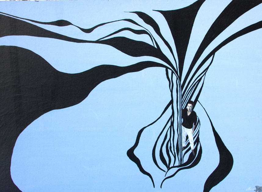 |
Posted on 01/04/09 8:37:03 PM |
|
Jota120
Ingenious Inventor Posts: 2615 Reply |
Re: Contest 242: Flying the flag, part 2
Its Bridget Riley (O'Reily), I hope she does not mind, I just like her work, but then I got carried away and went astronomical/maritime. Some deep meanings maybe..... and inspirerd. Not a copy, just inspired. Still honest. |
Posted on 01/04/09 10:45:44 PM |
|
Emil
KAFKAsFRIEND Posts: 413 Reply |
Re: Contest 242: Flying the flag, part 2
Here is my second try. Anna, James I like your animations. Very nice work. Jota, what a interesting picture. 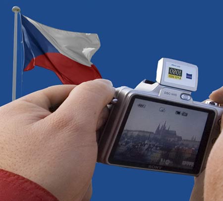 |
Posted on 02/04/09 10:16:16 AM |
|
james
Surreal Spoofer Posts: 1194 Reply |
Re: Contest 242: Flying the flag, part 2
Thank you Emil. Welcome to the forum.  |
Posted on 02/04/09 4:44:23 PM |
|
michael sinclair
Off-Topic Opportunist Posts: 1871 Reply |
Re: Contest 242: Flying the flag, part 2
James that's a cracker 
Here is a second attempt: 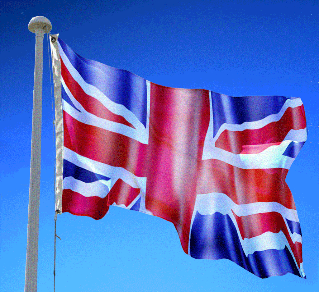 |
Posted on 02/04/09 7:48:27 PM |
|
james
Surreal Spoofer Posts: 1194 Reply |
Re: Contest 242: Flying the flag, part 2
Thank you Michael, I do value your opinion. Good to see you back. |
Posted on 03/04/09 00:47:55 AM |
|
Steve Mac
Grunge Genie Posts: 539 Reply |
Re: Contest 242: Flying the flag, part 2
 |
Posted on 03/04/09 07:25:48 AM |
|
wayne morton
Master Blender Posts: 97 Reply |
Re: Contest 242: Flying the flag, part 2
Really struggled with this one.... 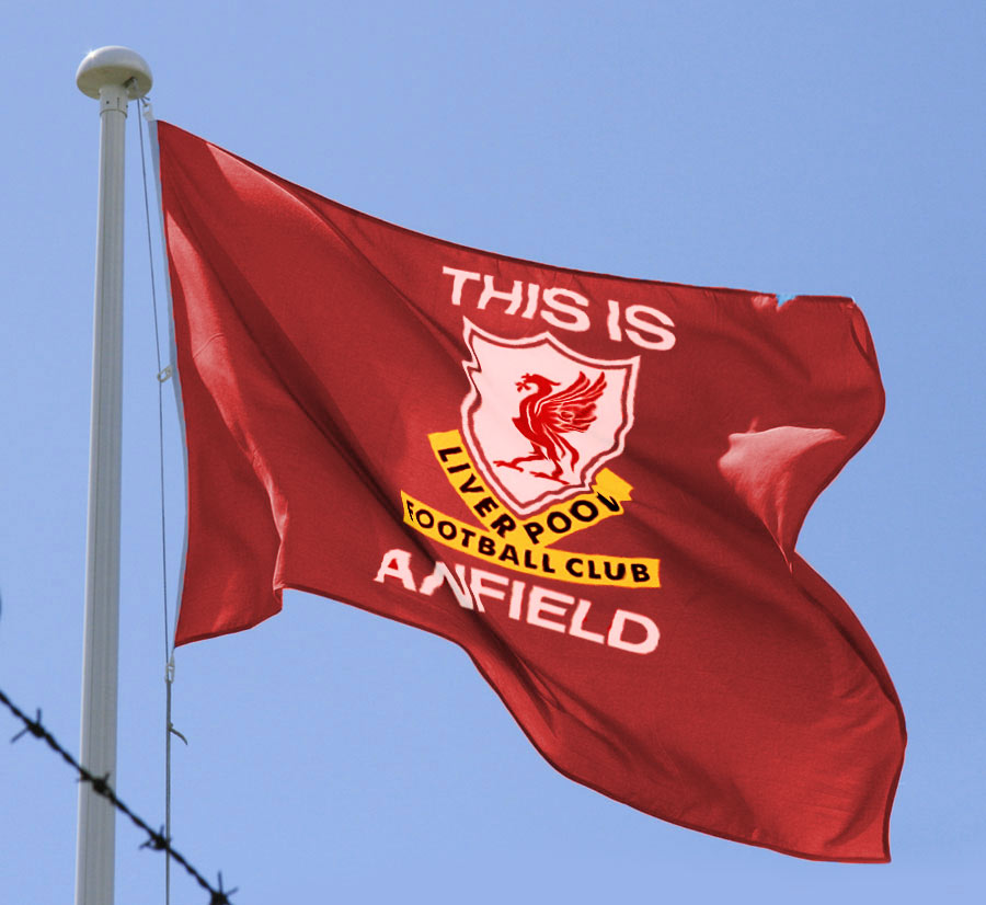 |
Posted on 03/04/09 09:19:17 AM |
|
Steve Caplin
Administrator Posts: 7180 Reply |
Re: Contest 242: Flying the flag, part 2
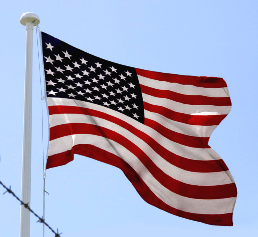
When I set this week's Challenge, I thought there would be fewer entries than usual - after all, it was a rather technical test. In the end, it seems like a huge number of you have taken part, including several old and new faces. First to take part, with his first Friday Challenge entry, was trainchou - who, being Chinese, had an easier time of it than most. It's a good fit, with a nicely recoloured flag and an angled set of stars that pick up the shading well. Good work - and welcome to the forum! This was closely followed by gaoxiguo - this Chinese flag is certainly one of the easier ones! It's a slightly paler flag, which gives it a more translucent quality, and I like the slight bend on the large star. The Union Jack, as TJ930 found out, is a different prospect altogether. Some good gross distortion here - on the bottom left, the bottom centre and the centre right - but we could do with more fine ripples altogether to make it match the distortion of the flag itself. An interesting approach from GKB, who has shifted sections of flag to make them appear to wrap around large folds and wrinkles. We seem to lose a lot of the texture on the white and red areas, though. Still, good to see the Red Arrows making a guest appearance. Love the second entry! A better version in the third entry - but make sure sections like the right side of the horizontal aren't over-enlarged in the process. By starting with a photograph of a real flag, The Mad Lep has immediately created the impression of realism. The trouble, though, is not with the shadow or the supposed "dinginess", but with those dead straight vertical lines: twist them to follow the flag's contours, and this could be perfect. I like the second entry - and most intrigued by the Irish spelling of "Cork". So many extra letters! A slight animation from michael sinclair - should the pole itself really be bending? The displacement map was the right way to go here, I think, but a little hand tweaking is needed to help with some of those wrinkles. You need to watch the thickness of those stripes in the second entry, Michael - the vertical in particular gets a little overwhelming! When using the displacement map approach, as vibeke has done, it's important not to use too high a setting. Although the distortion on the Union Jack part of the New Zealand flag works well, the stars are just too twisted out of shape - especially the one on the far right! The answer here is to paint on the distortion map until you get the results you want. It's working better in the second entry: maybe blur the distortion map a little more first? A convincing attempt from dave.cox - good to see you back, Dave. Some great wrinkles here, although I think a little more shading would help in the stars. What's happened to the bottom stripe, though? It seems to distort out of existence! The major distortion by Luis is most impressive: those stripes really seem to wrap around the flag. A few more fine wrinkles would help this one, but overall it's a highly convincing entry. Is it just my imagination, or are the stars rather on the small side? Is that the flag of Santa Fe on Tom's entry? It's not one I recognise. Liquify is certainly a good approach, but you have to watch that it doesn't make some sections too large - the middle right purple dart, for instance, looks somewhat oversized. I like the way it all rolls into that deep fold on the left. A terrific entry from zapat: I like the way the design rolls into those folds, especially the deep turn on the far right. A very convincing piece of work! A touch of rhetoric from maiden - and why not. I note that each small flag has been distorted individually to fit its new space, which is a nice touch. Overall, I like this one, but I do think it might be improved by the removal of all those flagpoles! A first entry from Emil, from the Czech republic - and a great flag it is, with contours that wrap around the folds and a great retention of the original texture. Lucky the Czech flag is an easy one to draw! I like the idea in the second entry, but why can't we see the flag on the back of the camera? Welcome to the forum, Emil. Nick Curtain has neatly sidestepped the problem by using the flag of St George - the English flag, rather than the British one. This means he was able to draw the design directly onto the flag. A great fit; I like the quality of the white especially, and the blurring on the flapping end is a really neat touch. The colouring of Emma's flag works well - I thought you were from Florida, though? The only problem here is those rigid straight lines, which really need to wrap around the folds in the photograph more. I love the sentiment in the second entry - again, though, distortion of the design is needed to make it really work. A hand drawn flag from Daniel H - are you sure a soft brush was the right approach? I think the verticals are still too straight, and need to bend over those large wrinkles more than they do. The colouring works well, though. A valiant attempt at the British flag - but why are those corners so rounded? Have you been using Refine Edges on the original design? A European approach from Ben Mills, with some neatly distorted stars curving well over those folds. The only change I'd make here would be to hide half of those stars on the far left, which should perhaps be hidden beneath that large fold - otherwise, this looks very good. Great treatment in the second entry! I liked james' flag, although I can't help feeling some more distortion is needed on those diagonals. Of course, it's the animated version that really shines out - I love the wave distortion, and the way the flag topples as the pole is chewed away is simply perfect. James, I've said it before, when it comes to animation you're a genius. A curious flag of the Order of St John from Eggbox - the ambulance people, Ted? Or have you joined a secret offshoot of the Knights Templar? This one does look rather more wrinkled than fluttering. Stay in after school and try again. Great distortion from brewell - those folds work really well. A little more saturation needed here, I think, and a touch stronger shadow in the white would help. I liked your original idea of giving up, and posting a white flag! A radical redesign of the Union Jack from Josephine Harvatt - beautiful! We should adopt it in time for the Olympics. Good wrinkling and folding - very classy altogether. There's a real faded, weatherbeaten look to Hope Leslie Laust's flag that makes it look as if it's been around for a while. Great distortion, but watch that some elements aren't stretched too wide - such as the right end of the third stripe down. I like the texture of this one. Good to see mguyer has been on his travels again - so did you adopt Panamanian nationality while you were there, Marty? Good ripples, especially on the stars: those verticals could do with a little more bending, I feel. I like the reworked second entry - a touch of flag missing bottom right, though! It seems horonggo has found this one particularly difficult - and yes, it was a very tricky challenge. The main problem here is with the lettering, which should at least follow the angle of the flag, bending downwards! And you need to make it pick up the shading from the flag beneath. Some slightly curious distortion in the still version from tooquilos - but, of course, it's the animated version that has all the fun. Love the kangaroo! I really can't imagine living in a country where those things hop around wild... A fabulous heavy metal entry from powerslave - nice work, Brendan! Not to my musical taste but it certainly ticks the visual boxes! I have to admit, katew, that I never knew Derbyshire had its own flag. You'll be telling me next that London has one. A good fit, with some elegant wrinkles: but I think the shading needs to be stronger overall. Very neat distortion from Chris Berry - a highly convincing job. Chris, you can see the layers beneath, it's an option within the Liquify dialog. I can't imagine how you managed to distort the design without seeing the flag! Our third new member this week is krb, with a tastefully distorted Stars & Stripes - very neat work on the large fold on the left, and I like the treatment of the small wrinkle on the far right. Good work, Kathryn - welcome to the forum! Fine work from wayne: sensitive handling of the wrinkles and intelligent use of the folds. The vertical is just too straight, though- look how much distortion there is on the right hand side of the flag. Otherwise, this is good. Good to see BigVern back - but whoa! Watch the level of that displacement map distortion! The top right, especially, shows far more white than could ever be in a Union Jack! Absolutely the right approach, but just too much of it! A Scottish flag from Jota120 - a neat approach, Trevor, but you do need to make sure those diagonals reach right into the corners. As these are hand drawn, it's the perfect opportunity to exaggerate the folds: that one bottom left, for instance, could have seen the stripe disappearing and reappearing further up. Love the second entry, with the homage to Bridget Riley! Good to see Pierre making a rare appearance - I thought only a Mini would tempt him back, but it seems his nationalist fervour was too much to resist. A very neat approach - good work! I like the setting for Gerard's Dutch flag - but there's a fuzziness in the design that could be sharpened up. The real problem here, though, is the shadow: it flattens out the background, making it look like the flag is lying on a photograph of shoes. Either lose it altogether, or move it much further away! Accurate and convincing work from Deborah Morley - beautifully accomplished, especially in the way the design fits on the larger folds. Excellent, Deborah. A welcome return from nerdtron, with a very neat working of the Filipino flag - it's the wrinkles on the bottom left that really make this one come to life. Good stuff. Giving up so easily, Cl&m&nt? Such a promising start! A good try from Steve Mac - but I don't think this sort of distortion is enough. You do need to make the design wrap around the deep folds, especially that one directly beneath the stars. A different kind of nationalism from Wayne Morton - and while the wrinkles work well, the whole emblem needs to be distorted first so that the baseline follows the shape of the bottom of the flag. I never said this week's Challenge was easy! This was a really tricky Challenge. Good work from everyone - a useful learning experience, I think. |
Posted on 03/04/09 09:58:42 AM |
|
katew
Virtual Virtuoso Posts: 681 Reply |
Re: Contest 242: Flying the flag, part 2
Thanks Steve. And the city of London does indeed have its own flag: http://www.skyblueleisure.co.uk/acatalog/Regional_Flags.html |
Posted on 03/04/09 10:07:14 AM |
|
Steve Caplin
Administrator Posts: 7180 Reply |
Re: Contest 242: Flying the flag, part 2
Kate, I had no idea we had all these regional flags! Most interesting. Very taken by the racy Northumberland flag, the jaunty Rutland and the pacy Guernsey. I do think the Isle of Wight needs a little livening up, though. |
Posted on 03/04/09 10:31:33 AM |
|
The Mad Lep
Four-Leafed Fantasist Posts: 323 Reply  |
Re: Contest 242: Flying the flag, part 2
Yes I had trouble with that.. couldn't get it to warp about in the way I needed. Thanks for the comments and enjoy Barcelona! 
|
Posted on 03/04/09 10:52:31 AM |
|
Eggbox
Ovoid Opportunist Posts: 797 Reply |
Re: Contest 242: Flying the flag, part 2
This is one I got really lost in. I did try again, Sir, honest and I did get a good(ish) one but the dog ate it! Indeed, the flag is of the Order of St. John the founder's (in 1877) of the voluntary ambulance and first aid charity. Ted |
Posted on 03/04/09 12:56:03 PM |
|
Emil
KAFKAsFRIEND Posts: 413 Reply |
Re: Contest 242: Flying the flag, part 2
Hello Steve, many thanks for your comments. I put on the back camera typical view of our capitol. It is townscape of Prague. So, I wanted connect the flag with our capitol and with travelers (camera) who mainly come to the Czech republic to see Prague. I have received my copy of the Art and Design book. Lovely book, thanks for it. |
Posted on 03/04/09 1:57:09 PM |
|
Tom
Texture Technologist Posts: 405 Reply |
Re: Contest 242: Flying the flag, part 2
It's Tibet, Steve.  |
Posted on 03/04/09 2:44:48 PM |
|
gaoxiguo
赤土陶 器战士 Posts: 114 Reply |
Re: Contest 242: Flying the flag, part 2
谢谢史蒂夫的评价,星的变形我使用了置换和液化处理,旗子的颜色浅是为了透明的表现,您想的和我一样! |
Posted on 03/04/09 3:05:20 PM |
|
EMMA
Everglade Artisan Posts: 91 Reply |
Re: Contest 242: Flying the flag, part 2
Hi Steve. I was borned in Napoli, Italy but I live in Florida now. Thanks for your comments. Have a great weekend. |
Posted on 03/04/09 8:44:07 PM |
|
BigVern
Q Quipper Posts: 674 Reply |
Re: Contest 242: Flying the flag, part 2
Thanks for comment Steve. Yes I see I was a bit ham fisted with my flag. Must learn to be a bit more delicate and take my time more. Some really nice work from others. |
| page: 1 2 3 4 5 6 7 8 last |