
| » Forum Index » The Friday Challenge » Topic: Contest 54: Spook it up |
|
Posted on 15/07/05 09:10:14 AM |
|
Steve Caplin
Administrator Posts: 7187 Reply |
Contest 54: Spook it up
This week's Challenge is shamelessly based on the image BobbyJo submitted to the Reader's Gallery a few days ago. The idea of taking a daytime shot of a ruin and turning it into a scary night view really appealed to me - so here's my own version, with a rather oddly-shaped ruin that really needs the horror movie treatment. Plenty of space on the left for moons, bats or whatever! High res is here. 
|
Posted on 16/07/05 10:07:32 AM |
|
Atomicfog
Virtual Visualizer Posts: 238 Reply |
Re: Contest 54: Spook it up
 _________________ -Atomic |
Posted on 16/07/05 6:26:18 PM |
|
Neal
Master Manipulator Posts: 322 Reply |
Re: Contest 54: Spook it up
Run for your lives! HE WALKS AMONG US!  |
Posted on 16/07/05 9:49:25 PM |
|
maiden
Golden Gif Gagster Posts: 471 Reply |
Re: Contest 54: Spook it up
Haha the zombification of Bush works really well, Neal, or has he just bumped into a Security Guard whilst out cycling again? 
_________________ mad as a badger and twice as furry |
Posted on 17/07/05 03:33:07 AM |
|
Neal
Master Manipulator Posts: 322 Reply |
Re: Contest 54: Spook it up
Actually, I checked The New York Times and he died in the poles. |
Posted on 20/07/05 2:05:32 PM |
|
mj
Guest Reply |
Re: Contest 54: Spook it up
The real villian. No polls needed. 
_________________ -Never met a PS'er I didn't like- Will Rogers |
Posted on 20/07/05 5:33:18 PM |
|
Dezolat0r
*** Posts: 159 Reply  |
Re: Contest 54: Spook it up
This image looks a lot better in Photshop than it does when viewed in Firefox. It seems to have an annoying blue 'wash' that only appeared when I clicked on Save for web with PS. Anybody know why that is?  |
Posted on 20/07/05 6:21:45 PM |
|
BobbyJo
Image Imaginator Posts: 250 Reply  |
Re: Contest 54: Spook it up
Spot the spook   _________________ BJ - Image Imaginator |
Posted on 20/07/05 7:55:23 PM |
|
Dezolat0r
*** Posts: 159 Reply |
Re: Contest 54: Spook it up
He's... he's huge!  |
Posted on 20/07/05 11:29:57 PM |
|
BobbyJo
Image Imaginator Posts: 250 Reply |
Re: Contest 54: Spook it up
It's a balloon
_________________ BJ - Image Imaginator |
Posted on 20/07/05 11:36:02 PM |
|
BobbyJo
Image Imaginator Posts: 250 Reply |
Re: Contest 54: Spook it up
Just realised I posted the wrong image again  The last one had a lot more shadows in the foreground. Will I ever learn ? The last one had a lot more shadows in the foreground. Will I ever learn ?
_________________ BJ - Image Imaginator |
Posted on 21/07/05 11:41:43 AM |
|
maiden
Golden Gif Gagster Posts: 471 Reply |
Re: Contest 54: Spook it up

click for larger version _________________ mad as a badger and twice as furry |
Posted on 21/07/05 1:17:05 PM |
|
Dezolat0r
*** Posts: 159 Reply |
Re: Contest 54: Spook it up
Ooops, knew I forgot something. Thanks maiden. 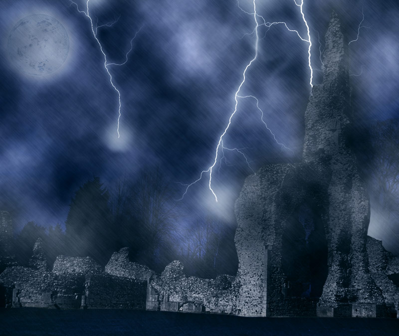 |
Posted on 21/07/05 3:01:49 PM |
|
maiden
Golden Gif Gagster Posts: 471 Reply |
Re: Contest 54: Spook it up
All you need now is Gene Kelly, Dezolator, doing his singing in the rain scene - now that would be horror. _________________ mad as a badger and twice as furry |
Posted on 22/07/05 01:37:04 AM |
|
Dezolat0r
*** Posts: 159 Reply |
Re: Contest 54: Spook it up
He walks (...er ... sings) among us! 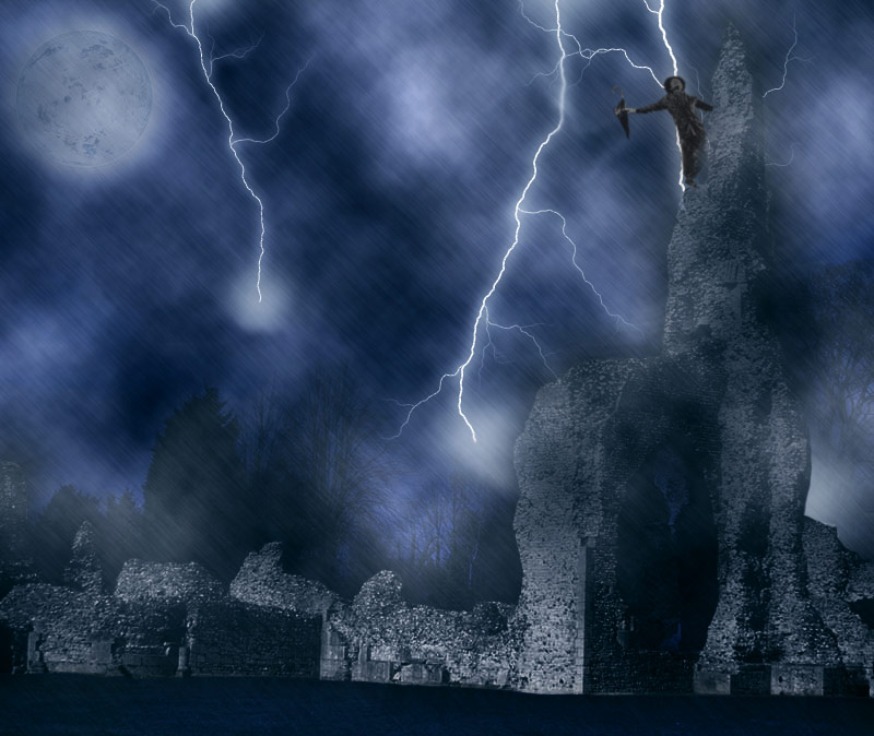 |
Posted on 22/07/05 08:22:12 AM |
|
Steve Caplin
Administrator Posts: 7187 Reply |
Re: Contest 54: Spook it up
What great work! Some really different approaches this week, and not a duff image among them. I've really enjoyed following this one. He may usually get in at the last minute, but Atomicfog was the first off the blocks this week. And what a good image! Not only the extreme moonlit contrast on the ruins, but a cloud with real danger and foreboding. This one's particularly suited to Atomic's Victorian style - you can almost smell the silver nitrate on the back of the glass. A classic. A really great picture of Bush from Neal this week. Just one thing, though - weren't you tempted to, you know, spice him up a bit? Seriously, there's superb detail in this one: the strings of muscle over the open cheek flap, the texturing on the flap, the revealed teeth (really nicely done!), eye socket, the brain cavity - even those wispy hairs sticking up at the back of the head. I think the only thing I'd have done differently would have been to use Liquify to change his expression a little - but your call on that one. Top job. MJ, I can't quite make out who you've got hidden in that fiery smoke. Looks like Castro, but I guess it could be anyone with a beard - Bin Laden, Rasputin, even a late model Saddam Hussein. Don't think it's Edward VII, but you can never tell Three goes from Dezolat0r this week, with an improvement each time. You can see the sky clearer in the first, so this is where I'll talk about the Clouds filter. Great though it is, it does tend to create flat, photo-studio backdrop textures with no depth to them. If you want to use them for clouds, then add a lot of perspective distortion to get the sense of them receding into the background (and getting smaller as they approach the horizon). The rain works well in later images, though, and I really do like that lightning! Gene Kelly looks like he's dropped out of The Exorcist there - could have been an interesting career move for him. As for your 'Save for Web' issues, are you perhaps giving the file too limited a palette? That's about all I can think of. Great moody work from BobbyJo: love that mist! and the way the second bat is faded really gives it a sense of distance. Great technique, there, must make a note of how effective it is. The moon's perhaps a little yellow for my taste, but I do like the ghost. Scariest thing for me, though, is the monster-sized cat. Is he supposed to be enormous? Or do we have a slight perspective issue here? I love maiden's headless horseman - although from the dripping axe, he appears to have just chopped off his own head, which is something of a feat. Excellent rain texture, there's a real sense of movement and menace there. Only thing I'm not sure about here is the lightning: it looks a little unnatural, at least compared with Dezolat0r's version. Are you both using EyeCandy? If not, I'd be interested to know the technique! |
Posted on 22/07/05 09:17:19 AM |
|
Dezolat0r
*** Posts: 159 Reply |
Re: Contest 54: Spook it up
The Clouds were meant to represent fog more than anything... but I see what you mean. Thanks for the advice. |
Posted on 22/07/05 09:44:08 AM |
|
maiden
Golden Gif Gagster Posts: 471 Reply |
Re: Contest 54: Spook it up
It's funny that you should think I was using Eye Candy for the lightning effect as mine is the real thing taken from this website Lightning at Sea I increased the contrast using curves and in Blending Options I eliminated all but the lightning and it's glow by using the Layer sliders. I could have opted easily enough for Eye Candy but I wanted to retain a sense of realism which doesn't seem have worked, which surprises me. As For the Headless Horseman, in the film Sleepy Hollow The Headless Horseman collects other people's heads until his own head is returned to him by the witch who has him in thrall. Here's the source picture I used which is a lot more clearer Headless Horseman As for the dripping axe I'm confused - while as you can see from the source picture the axe is blood stained the 'drip' as you describe it is speculative highlights on the metal of the axe illuminated from the lightning strike, here I used the Brush tool where I selected a star shaped brush set to white and dabbed in where I thought the hightlight would occur. I seem to have failed on so many levels here _________________ mad as a badger and twice as furry |