
| » Forum Index » The Friday Challenge » Topic: Contest 72: Pill popping |
|
Posted on 23/11/05 7:44:30 PM |
|
Paul McFadden
Dream Decryptor Posts: 138 Reply  |
Re: Contest 72: Pill popping
Great work Born2Run ! Especially on the caption front - I thought "Chav B Gon" was class, but, "If you're at a loss, Unscrew the boss !" is even better !! _________________ |
Posted on 23/11/05 8:43:09 PM |
|
BobbyJo
Image Imaginator Posts: 250 Reply  |
Re: Contest 72: Pill popping
Here's mine. Don't take 'em all at once   _________________ BJ - Image Imaginator |
Posted on 23/11/05 9:18:50 PM |
|
BobbyJo
Image Imaginator Posts: 250 Reply |
Re: Contest 72: Pill popping
Sorry people. I forgot that glass is actualy transparent   _________________ BJ - Image Imaginator |
Posted on 23/11/05 9:54:52 PM |
|
rufus
Destructive Demon Posts: 243 Reply  |
Re: Contest 72: Pill popping
I know the feeling. Well done Bobby Jo that looks great. |
Posted on 24/11/05 00:23:19 AM |
|
roy
* Reply |
Re: Contest 72: Pill popping
Hope no-one's offended at my little 'dig' this week, but felt that some great efforts this week were let down by typing errors! Doh! And incidentally, after reading some of this week's, (and other recent) postings, isn't this a fun site? Can we not agree to differ socially, but also agree that Photoshop attracts all sorts of people with very different viewpoints? Viva la difference!  |
Posted on 24/11/05 02:49:57 AM |
|
jwhite
Collage Critter Posts: 274 Reply  |
Re: Contest 72: Pill popping
Thank you for the constructive criticism. I tried to "fix" the label using the free transform > warp mode. I think the label now looks better, but does it look right? |
Posted on 24/11/05 08:20:42 AM |
|
rufus
Destructive Demon Posts: 243 Reply |
Re: Contest 72: Pill popping
It does look better but perhaps it's a little bright. Here I have copied the label, filled the copy with black and put it behind the original. Then on the original I used a layer mask with a reflected gradient between two shades of light grey (as the foreground and background colours). This reduces the brightness and gives the effect of a curve on the label.  |
Posted on 24/11/05 09:33:16 AM |
|
vigar
* Posts: 9 Reply |
Re: Contest 72: Pill popping
I hear the swimming is great in Blackpool  |
Posted on 24/11/05 10:25:54 AM |
|
maiden
Golden Gif Gagster Posts: 471 Reply |
Re: Contest 72: Pill popping
Yes, looks a lot better now and with Rufus' brighteness correction it would look as near perfect as it could be. Some of the entries this week are simply stunning, I however have had a lack of inspiration on this one, which I hope is just a temporary thing, like a good writer facing a blank page they know they'll be hit by inspiration sooner or later but at the moment I can only tear my hair out with frustration. _________________ mad as a badger and twice as furry |
Posted on 24/11/05 10:52:59 AM |
|
trinityofone
Guest Reply |
Re: Contest 72: Pill popping
Well, at least we all know how to put it back now  _________________ A happy-go-lucky chap, always dressed in black |
Posted on 24/11/05 11:14:27 AM |
|
maiden
Golden Gif Gagster Posts: 471 Reply |
Re: Contest 72: Pill popping
Haha - the wind-swept look is my main style _________________ mad as a badger and twice as furry |
Posted on 24/11/05 12:03:20 PM |
|
jwhite
Collage Critter Posts: 274 Reply |
Re: Contest 72: Pill popping
Rufus, Thanks for the suggestion & example. I darkened the label by decreasing its opacity to 90%. Maiden, thanks again for your suggestions. I hope that you find your inspiration as I enjoy seeing your work along with all the others. |
Posted on 24/11/05 12:20:42 PM |
|
Dek_101
Apocalyptic Artisan Posts: 175 Reply  |
Re: Contest 72: Pill popping
[quoted] At 00:23:19 AM 24/11/05, Roy wrote: Hope no-one's offended at my little 'dig' this week, but felt that some great efforts this week were let down by typing errors! Doh! And incidentally, after reading some of this week's, (and other recent) postings, isn't this a fun site? Can we not agree to differ socially, but also agree that Photoshop attracts all sorts of people with very different viewpoints? Viva la difference! Oh Bugger!!! .... And Was all so pleased with my effort till you pointed that out ... nevermind ... I appreciate you pointing it out and will consider it a lesson learned ... Excuse me while I go off and shoot my proof reader  |
Posted on 24/11/05 4:08:25 PM |
|
metacool
* Posts: 13 Reply  |
Re: Contest 72: Pill popping
here is mine... spend a little time on this, ..when i come home i will read the chapter dedicated to this stuff...this is a good exercise... 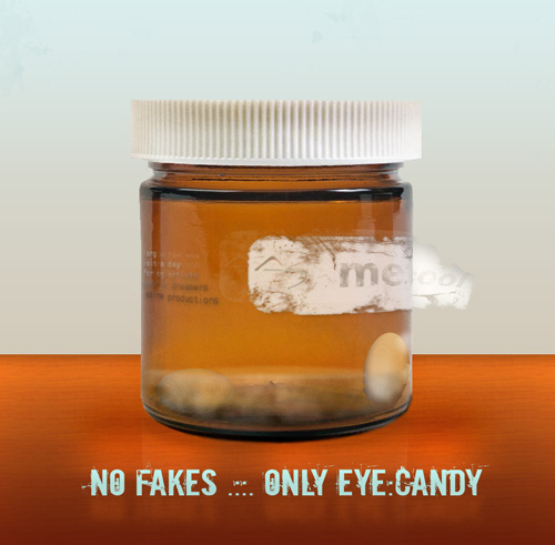 _________________ www.metacool.org |
Posted on 25/11/05 01:59:39 AM |
|
Glen
Montage Maestro Posts: 282 Reply  |
Re: Contest 72: Pill popping
and finally.......  _________________ most of the lack of sunshine in our lives is caused by us standing in our own shadow |
Posted on 25/11/05 09:52:36 AM |
|
Steve Caplin
Administrator Posts: 7180 Reply |
Re: Contest 72: Pill popping
Some truly outstanding work this week! I think this Challenge has given everyone the chance to really excel themselves, and the results have been hugely impressive. Born2Run got in first, with a great chav gag - and for those of you not familiar with this term, it relates to a particular demographic grouping of young British males. The hats fit the shape of the bottle well, and the label's a good design: applying a horizontal application of the Spherize filter makes the edges wrap around in a cylindrical fashion perfectly. Only problem here is the curve on the label: while the top is fine, the bottom is far too flat. This is the kind of job it's really tricky to do without the Image Warp feature of CS2! And another good joke in the second entry, epsecially the way Springsteen's guitar neck pokes out of the hole in the bottle. Shouldn't the hole have a little more thickness to the glass, though? A very fine dental approach from mguyer, with a set of teeth that look perfect in the jar. Excellent work, Martin: the shading on the teeth is just right, and the change of scale above the liquid simulates refraction perfectly. Even in the second version, though, you still have a slight problem with the lettering: it shouldn't really be slanted at all, but curved (keeping the verticals upright) and condensed at the edges, as in Born2Run's post. i think Steve Hill needs to open his jar and pop a few more of those brain pills! The pills fit well within the space of the jar, but we can see the base of the jar through them. Opacity is a must with pills of this kind. I like the placement of the brains on the label, but would really like to see it wrapping around the jar more - perhaps with some shading at the edges to give it a sense of curvature. A good first gag from Lexus - although why is that red circle so pixellated on the right? Surely you just drew that? We don't really get a sense of the label wrapping around the bottle, though. Shading, certainly, but also horizontal Spherize needed here. A little confused about the second entry: it looks a bit like a joint, a bit like an artery, and a bit like a rolled-up newspaper that's inexplicably gashed down one side. And are you sure about the texture of that liquid? Seems far too detailed to me. Fantastic work from Paul 2005, both with pills that fit the shape and shading of the bottle perfectly and a label that matches the curvature of the bottle. This label has been photographed, not drawn, but I suspect that it wrapped further around its original container: the angle at which we're looking at the extreme edges suggests that the label should extend right to the sides of the bottle. It's almost too realistic for its own good! David Asch is being mischievous again. What is it about Lexus that makes everyone want to tease him? Let's hope this one doesn't get posted around his school! The Spherize filter needs to be applied to the label in mr.pbody's Dumb-Ass bottle as well - but here, there's a bit of a problem with the pills themselves, too. Firstly, the bevelling is far roo small ti give the impression of roundedness; they look more like disks than pills. And shouldn't they bend in perspective as they wrap around towards the edges of the bottle? A good joke, mr p, but you need to work on that technique! The pill fitting and label wrapping are near perfect in rufus's entry. In particular, I really like the way each title has been spherized individually to fit the pills! This must have been a lot of work, and it's really paid off. Adding the shading to the label in the second entry was a great move, which really helps the realism. A good stab at the reflection - this is a really tricky one to get right, and it very nearly works. But shouldn't the shadow of the glass areas be translucent? Great label, great shading on Dek_101's entry. For added realism, though, the text on each pill should be in a slightly different position, so they're not all facing directly towards the front. And I know I was the first to scoff when Photoshop introduced a spell checker, but you do need to make sure you've remembered the N in 'inspiration' before duplicating so many pills! Fantastic work from Glen, with a Pils bottle (great gag) that includes thoroughly realistic bubbles and some great foam pouring over the top. Taking the lid off the bottle is a bit of a tour de force as well, with a detailed screw top that really looks the business. Love the reflection, the angle's just right: but whouldn't we be able to see the reflection of that drip of foam as well? Radial blur, eh? It really adds life to kenny's entry, and I especially like the way the colours show through on the edges of the bottle. Have to say, though, I've never seen acid in the form of diced carrots before - but hey, if it makes the stuff more healthy, then why not? Fantastic joke, and a great strip of tape in Neal's M&M bottle. The main label works perfectly here, as do the pills inside the bottle (although they're perhaps a little too strongly coloured at the bottom) - but there is a perspective issue with those labels on the left, which don't quite follow the angle of the bottle. A good weathered, textured feel to the whole image, here. Great to see someone making good use of those skeletons I included with the third edition CD - and stefan has used one to create a really strong, powerful image. The text and texture on the label are exactly right for the scene, and there's even the reflection of the skeleton's hand just visible on the surface of the bottle itself. Fantastic work! And one which, I think, really deserves a title for Stefan. It's the attention to detail that really makes this one work so well - so Detail Demon it is. Excellent stuff, Stefan! Great to see Tabitha back after an extended absence - but I think the avatar gives us her excuse. A great montage - does everyone here buy their pills from Lloyds Pharmacy? - with a really good tumbling effect on those pills spilling out of the bottle. I'd like to have seen some more distortion where the pills are viewed through the screw top of the bottle, though: that variation in glass thickness should really bring about much more refraction. Welcome back! I know jwhite is a bit of a wildlife fan, but I do think cramming a snake into a jar in order to take this picture was perhaps taking the Challenge a little too far. Oh, unless it was all done in Photoshop, that is. Great snake, with perfect shading and fitting! The label does need some attention, don't you think? When I first looked at BobbyJo's entry, I was going to make a comment about transparency - but I see she's addressed that in her second entry. This is really good: creating transparency effects is very tricky, and this is an excellent approach. Again, though, some refraction distortion would really have helped here. Simple solution: duplicate the background, enlarge it slightly, and mask it so it fits the shape of the bottle. Then it will look perfect! My eyesight may have suffered as a result, but I did read all the way through the small print in Roy's entry and didn't spot a single typo. Great work! A really good label, perfect pills, and a convincing reflection. Just wondering, though - why is there such a soft line between the floor and the wall in the background? Did you do this montage on a foggy day? Vigar's set himself a tricky task: to show a shark's fin above the water - which works well - while being able to see the shark beneath the surface as well. Hang on - where's that shark gone? Shouldn't we be able to see at least a shadowy form in all that liquid? Really good toxic texture to the water, though. Best of all here is the distortion of the bottle: I had to refer to the original several times before I was convinced that this really was the same bottle I'd supplied you with, but I'm sure it is. What a great perspective job! Admirable! Peeling labels are hard to do, and metacool's entry comes very close to it. i think the problem comes from us being able to see the edge of the jar through the label, which gives it a transparency that really shouldn't be there. But elsewhere - great shading on the smal text on the side, and the reflection of your title text is a very nice touch. I'd say those pills are past their pop-by date, though. And finally What a great joke to end on! Glen's viagra bottle is the best joke of the week - but look at all that detail! The refraction of the background seen where it overlaps the bottle, the subtle shadow, the perfect fitting of the pills. Brilliant! If I have to make a criticism - and, you know, I can never resist - it's that if we're looking directly at the horizon line, then surely the perspective of the bottle above it should be going in the other direction? In other words, we should be looking up at the top of the bottle, not down on it! I've really, really enjoyed looking through this week's entries. Fantastic work from everyone - keep it up! |
Posted on 25/11/05 11:26:47 AM |
|
maiden
Golden Gif Gagster Posts: 471 Reply |
Re: Contest 72: Pill popping

too late I know but hey ho here it is. _________________ mad as a badger and twice as furry |
Posted on 25/11/05 11:34:32 AM |
|
Steve Caplin
Administrator Posts: 7180 Reply |
Re: Contest 72: Pill popping
Fantastic! Great joke! |
Posted on 25/11/05 5:41:39 PM |
|
Lexus
Persistent Pixellator Posts: 623 Reply  |
Re: Contest 72: Pill popping
Oh God, Please Make That Not Happen! _________________ Lexus |
Posted on 25/11/05 5:45:43 PM |
|
Lexus
Persistent Pixellator Posts: 623 Reply |
Re: Contest 72: Pill popping
Ok, Its a finger, im sorry i should have made it more finger-ish but hey! And the liquid is meant to be dirty and swirling around on the side, and its meant to be bubbles at the top. I agree, its not my best work. And i did Horizontal Spherize it, but it didn't work much. I'll try harder next time! _________________ Lexus |
| page: 1 2 3 4 last |