
| » Forum Index » The Friday Challenge » Topic: Contest 63: Putting the boot in |
|
Posted on 23/09/05 09:31:20 AM |
|
Steve Caplin
Administrator Posts: 6838 Reply |
Re: Contest 63: Putting the boot in
Inventiveness and technical skill are two separate assets, and it's been great to see the two combined with such vigour in this week's entries. Some really great work - and a huge variety of approaches! Born2Run's submarine is a deceptively clever piece of work. Tinting any object to look as if it's underwater is tricky, and this one does the job really well: the play of dappled light from above works perfectly, and the periscope is a great touch. I might have twisted the lace so it looks like it's floating - or at least twisted a copy behind the boot - but this is a great job. And the second entry is a real cracker - great distortion on the drill sergeant, and a neat line of boots. Great work! A really fine beanstalk in Glen's first entry, twisting away convincingly into the clouds: it's that part where it disappears behind the clouds that really makes this one work. The figures, including the climber, fit well - and it's a really entertaining piece. And fitting the boot into the second image was a classic piece of photomontage: the toning, the scale and the paper tears combine to make this one work perfectly. Great job! Sometimes a stock image works exactly the way you want it to, and CWBasset has dug out the perfect image here. A really funny image, and a seamless montage to boot (ha ha) gives this one top marks. No dogs this week, Chris? And sorry for assuming you were a he, I just don't know many female accountants who are into graphics! Photoshop filters can often lead us into the trap of piling on the effects in an inappropriate manner. But uk2usadaz has created a stunning graphic effect for his cartoon drawing that really fits the bill: a thoroughly good job, beautifully realized - the earth texture, the grass over the boot, and especially the poor worm's expression really do it for me. Charming! The real skill in rufus' entry was to create a second boot that matched the first without it looking identical. Great angles, great shadows, and I particularly like the way the laces have been drawn to make the book hang from the peg. A classic montage, executed with typical skill. Excellent! mguyer's taken some time off from pulling molars to give us a great wedding car, with a good sense of speed and a neatly bouncing boot at the back. To complete the scene, though, I'd have added a touch of shadow beneath the boot, which would have given us a greater sense of it hovering above the road surface. Another way of approaching this one would have been to show the car crisply, but to motion blur the background: try it, and see if you like the results! Is j_white really our old friend John White, with a different log in? I'd have guessed so, given the wildlife theme. Either way, let's hope that boot's sole is tough enough to withstand venemous attacks! Something about the blur, though, seems to make the boot recede into the background, so it looks as if it's crashing down way behind the snake. Is it perhaps because the scale of the leaves is so much larger? Motion blur is a tricky job to get right; and I think blurring the whole thing may not be the right approach here. Neat typography, though. Neal's flattened hamster is all too familiar nicely flattened, I really like the way it's peeling off the bottom. I must admit, I hadn't come across this digital pet before - but a quick visit to www.hamtaro.com cleared up the confusion. Serves the little tyke right! Looks as if kenny got kenny junior to pose specially for this one - and a fantastic piece of work it is, too. The shading, the distortion of the ear, the expression, and above all the flying tooth - what a lot of detail in this picture! Not sure it's best dental practice, though we'd have to get mguyer in as a consultant on this one! Ah, the old Motion Blur thing again I really like the composition in Paul McFadden's entry, all that white space is a real treat. But the blur itself? I don't know, it doesn't really seem to work for me. For this kind of cartoony blur, I think you need a longer Motion Blur streak - and it really helps to add a touch of the Wind filter, to stop it being so smooth: 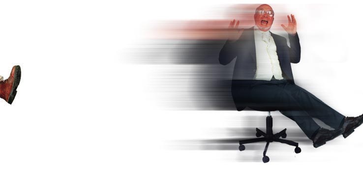
Fantastic car-crushing action from Atomicfog, with a heel that's really crunching down into that BMW. The tilting of the back wheel is a great touch, it gives a real sense of the weight of the boot on top of it. Only thing I'm not sure about is the shadow behind the book, which seems a little artificial on the shop front, but it's a really dynamic image. If Neal hadn't earned himself a custom title ages ago, he'd certainly get one for his fantastic second image. The expression on Bush's face, the wild hair (is that a new technique?) and, above all, the perfect bruised boot impression on the side of his face - what a great job to end this week's Challenge with! Classic! |
Posted on 23/09/05 12:05:21 PM |
|
Paul McFadden
Dream Decryptor Posts: 138 Reply  |
Re: Contest 63: Putting the boot in
a great improvement ! Thanks ! _________________ |
| page: 1 2 last |