| » Forum Index » The Friday Challenge » Topic: Challenge 916: The Royal Watercolour Society |
|
Posted on 21/07/22 8:27:11 PM |
|
DavidMac
Director of Photoshop Posts: 5666 Reply  |
Re: Challenge 916: The Royal Watercolour Society
Do you remember the original 1967 Apple store in Baker St? That is Apple as in Beatle's record label - not Apple as we know it today. Westminster council made them repaint it white. The story goes that this is what prompted the cover of the famous 'white Album' that was to follow. Although not remotely like it, your flower power image took me straight back there Micheal. 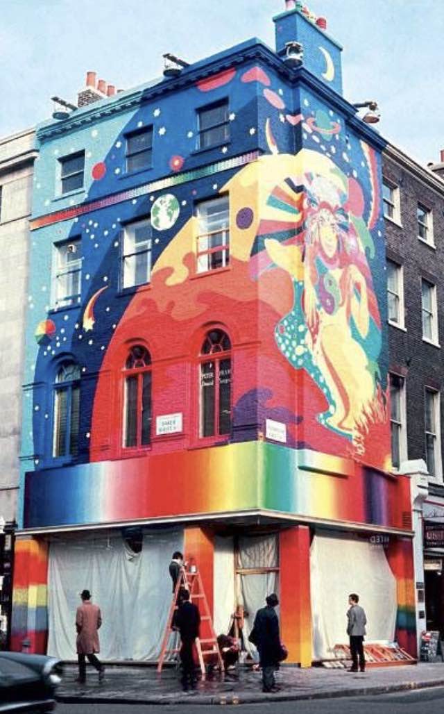
_________________ The subtlety and conviction of any Photoshop effect is invariably inversely proportional to the number of knobs on it ....... |
Posted on 21/07/22 11:15:57 PM |
|
Mariner
Renaissance Mariner Posts: 3055 Reply |
Re: Challenge 916: The Royal Watercolour Society
Yes, David. I was a big Beatles admirer back in the 60's and early 70's and still miss those days. My picture is an attempt to imitate the Art Nouveau style of the late 19th and early 20th centuries. It would have taken me many days to create it from scratch, so its a bit of steal really, although I have added something to it. Alphonse Mucha is close to the top of my list of favourite artists. |
Posted on 22/07/22 07:38:37 AM |
|
Ben Boardman
Printing Pro Posts: 610 Reply |
Re: Challenge 916: The Royal Watercolour Society
Unfortunately no time this week. Contest reminded me of this building in Italy. Great work everyone.  |
Posted on 22/07/22 08:40:20 AM |
|
Steve Caplin
Administrator Posts: 7023 Reply |
Re: Challenge 916: The Royal Watercolour Society
First to dip into the watercolour palette was DavidMac, with a not-at-all-tacky painterly effect. Interesting to see the blobby effect at the junction of the windows glazing bars. I enjoyed the second entry, with its intricate treatment of the windows - in particular, the tonal balance to brighten the dark panes of glass, and the added colour panels between them. However, you do need to address the angle of view of the brush: 
A really funny gag from Ant Snell, with the watercolours running in the rain - not just ingenious but beautifully accomplished. Those drips are exactly right, and I like how they run across the pavement and into the gutter. A fun watercolour effect from Josephine Harvatt, with a great smudge effect. I like the huge water drops. Very cute. Subtle painting from Vibeke, the restrained palette of autumn colours producing a beautiful effect. The abstract nature of the painting really adds character to the building - and I do like the painters at work. Charming. A riot of colour and texture from Mariner, who has completely redesigned the facade in a postmodern mashup of garish colours. Now thats the way to make a dull building more interesting! You do, perhaps, need to address a couple of viewpoint issues, most notably in the scrolls at the bottom and the louvres beneath the upper left window: 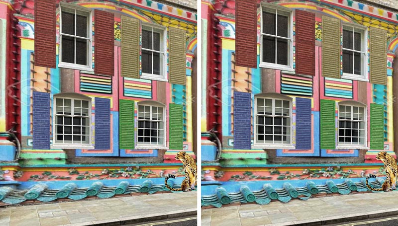
I like the much more restrained second entry, with its intricate stylised art nouveau design artfully symmetrical around the door and windows. Of course most of the effort here must have gone into cleaning up the brickwork, which is an impressive feat. A patriotic entry from michael sinclair, the most interesting thing being the squaring up of the viewpoint. The windows are especially well recreated from this new angle. It must have been a lot of effort. I like the Ukraine flag in the second entry, and the rolling clouds in the third entry. The overlaid view of the cathedral dome in the fourth entry is really splendid, baffling the senses and challenging our expectations. The balloons in the fifth entry are fun, but I find the scrolling texture in the sixth entry just a little unnerving. The fire in the eighth entry is a good idea - but you need to skew it down so the right hand edge starts at ground level. The train in the ninth entry is very fine, but imagine how impressive it would be if it could come through the door A painterly painter from tooquilos, artfully positioned across the building with a splendid reflection in the water. I like the stone walkway to the entrance. The blend of textures in the animated version is hugely entertaining: I particularly like the water splashes that retain the view of the brickwork behind. And the underwater swimmer makes a good finale. Party time for lwc, with a serious light show behind the windows. Glad youre finding the images of people from the back useful - I photographed them all because pictures of backs are so hard to find. All thats missing here is a moose. Frank says hes not been inspired this week - but this is a beautifully thought-out and executed entry, the two faces imaginatively positioned and rendered as convincing watercolours. The pastoral scene above makes good use of the upper storey. I like the added cyclists, who bring a human element to the image; and the raised palette over the door makes an excellent sign. This is splendid work, Frank. Hope you get over the plague soon. |
Posted on 22/07/22 09:06:26 AM |
|
Mariner
Renaissance Mariner Posts: 3055 Reply |
Re: Challenge 916: The Royal Watercolour Society
Thanks for the correction Steve. This Challenge was much more interesting than it first seemed, hence the second entry. |
Posted on 22/07/22 10:53:08 AM |
|
josephine harvatt
Gag Gadgeteer Posts: 2603 Reply |
Re: Challenge 916: The Royal Watercolour Society
Thanks Steve  _________________ I'm not really bad - I just draw that way |
Posted on 22/07/22 11:25:54 AM |
|
lwc
Hole in One Posts: 3218 Reply |
Re: Challenge 916: The Royal Watercolour Society
Ha... I couldn't get the 'moose' version to work properly for me, so it was abandoned... thanks Steve. 
|
Posted on 22/07/22 1:22:45 PM |
|
Frank
Eager Beaver Posts: 1739 Reply |
Re: Challenge 916: The Royal Watercolour Society
Thanks so much Steve, never expected that. Day 8 of Covid and it still hangs on. Onwards and Upwards. Thanks again. |
Posted on 22/07/22 3:00:35 PM |
|
DavidMac
Director of Photoshop Posts: 5666 Reply |
Re: Challenge 916: The Royal Watercolour Society
I just knew you would say that Steve! This is probably a case of being far too clever for my own good but there is some quite convoluted thinking going on behind this. This is quite hard to put into words but it all depends on the viewpoint. Your comment is entirely valid if you pre-suppose that the wall was painted with your camera angle as the viewpoint. But there is no real reason to necessarily assume that at all. It's pure chance. That viewpoint just happens to be where you took the picture and does not necessarily bear any relation to the artist's viewpoint when he painted it. I conceived this as painted face on from directly opposite. In this instance the brush would be in profile and the edge of the ferrule, etc. would present as a straight line not an ellipse. It is an instinctive reaction to want to correct for the photograph's viewpoint of a cylindrical brush, as you have done, but that would not if fact happen as the brush is in reality a flat profile painted on a flat surface but viewed from an angle. The vertical straight lines would remain straight lines and the brush would present in the angled view exactly as I have depicted it. It's deliberately 'wrong'. Now is that twisted or is that twisted? _________________ The subtlety and conviction of any Photoshop effect is invariably inversely proportional to the number of knobs on it ....... |
Posted on 22/07/22 4:42:57 PM |
|
Steve Caplin
Administrator Posts: 7023 Reply |
Re: Challenge 916: The Royal Watercolour Society
David - Id assumed from the shading that it was a three dimensional brush inset into the wall. Maybe I just viewed it wrong! |
Posted on 22/07/22 5:34:17 PM |
|
DavidMac
Director of Photoshop Posts: 5666 Reply |
Re: Challenge 916: The Royal Watercolour Society
No it's a trompe l'oeil painted on the wall. Seems I managed that bit OK. _________________ The subtlety and conviction of any Photoshop effect is invariably inversely proportional to the number of knobs on it ....... |
Posted on 22/07/22 8:57:23 PM |
|
vibeke
Kreative Kiwi Posts: 2166 Reply |
Re: Challenge 916: The Royal Watercolour Society
Thanks, Steve, Good to be back with a fast computer. _________________ Perfect confidence is granted to the less talented as a consolation prize. |
Posted on 23/07/22 12:29:24 PM |
|
tooquilos
Wizard of Oz Posts: 2898 Reply |
Re: Challenge 916: The Royal Watercolour Society
Thank you Steve _________________ Wicked Witch of the West: I'm melting! I'm melting! |
| page: 1 2 3 last |