
| » Forum Index » The Friday Challenge » Topic: Contest 80: Bye bye, beautiful bus |
|
Posted on 25/01/06 5:31:38 PM |
|
Slim
* Posts: 29 Reply  |
Re: Contest 80: Bye bye, beautiful bus
Many thanx to Kenny and Daltox for the help with file sizes, especially Daltonx's picture tutorial, sorry to post the same picture again but i have to try it out.  |
Posted on 25/01/06 11:18:54 PM |
|
DaltonX
Raster Reanimator Posts: 259 Reply |
Re: Contest 80: Bye bye, beautiful bus
great job slim... glad I could help...... your pic is far better now that it's enlarged... I like it a lot.... but then.... I may be a lil bais cuz ya put me in the pic  good work! good work! 
|
Posted on 26/01/06 02:46:36 AM |
|
Tom
Texture Technologist Posts: 405 Reply |
Re: Contest 80: Bye bye, beautiful bus
Couldn't think of anything nice...  |
Posted on 26/01/06 2:45:34 PM |
|
Neal
Master Manipulator Posts: 322 Reply |
Re: Contest 80: Bye bye, beautiful bus
It's not a retirement, but a refitting. The latest transit strategy is not move lots of people slowly, but move fewer people faster. These buses are given a new life with turbos and beefy engines. The debate is should the speed limit stay sub-sonic. At top speed, these buses introduce a complex physics which lets you arrive earlier than when you left.  |
Posted on 26/01/06 5:28:55 PM |
|
Lexus
Persistent Pixellator Posts: 623 Reply  |
Re: Contest 80: Bye bye, beautiful bus
HAHAHA NEAL! THATS ONE GREAT PICUTRE! _________________ 3 Radio Visit http://www.3-radio.co.uk and listen! You will love it! |
Posted on 26/01/06 9:46:11 PM |
|
Born2Run
Digital Dude Posts: 132 Reply |
Re: Contest 80: Bye bye, beautiful bus
Maybe they could use it in Vegas!  _________________ Til' then tramps like us, baby we were born to run |
Posted on 26/01/06 10:51:14 PM |
|
paul 2005
Guest Reply |
Re: Contest 80: Bye bye, beautiful bus
Here is my (hurried) attempt. It's a little known fact that all the London Routemasters have not been accounted for. The 260 to Barnet is running a little late 

higher res http://img382.imageshack.us/img382/4186/mybus0fx.jpg I really lack imagination. Sorry. |
Posted on 26/01/06 11:48:10 PM |
|
chris
Photo Parodist Posts: 138 Reply |
Re: Contest 80: Bye bye, beautiful bus
Er.... sadly had very little time this week, got in about 90 mins tonight which was spent mainly trying to recreate a rust effect and therefore its totally unfinished and didn't even get time to put it in the environment i intended. However I am quite pleased with the rust result and am mainly looking for feed back on that. Hopefully i'll finish it in the near future. Steve go easy, so little time so much to do. |
Posted on 26/01/06 11:49:11 PM |
|
chris
Photo Parodist Posts: 138 Reply |
Re: Contest 80: Bye bye, beautiful bus
Oops might help if I posted the pic!  |
Posted on 27/01/06 00:43:36 AM |
|
jwhite
Collage Critter Posts: 274 Reply  |
Re: Contest 80: Bye bye, beautiful bus
Partridge Propagation  |
Posted on 27/01/06 01:28:39 AM |
|
mr.pbody
*** Posts: 138 Reply  |
Re: Contest 80: Bye bye, beautiful bus
nice...exactly what i was thinking before cheech and jimi joined in! |
Posted on 27/01/06 03:30:02 AM |
|
jwhite
Collage Critter Posts: 274 Reply |
Re: Contest 80: Bye bye, beautiful bus
Thanks! Not sure if the forum members in the UK know of the Partridge Family or not. |
Posted on 27/01/06 08:09:15 AM |
|
Dek_101
Apocalyptic Artisan Posts: 175 Reply  |
Re: Contest 80: Bye bye, beautiful bus
Of course we do J .. well .. those of us over a certain age anyway .. erm .. Maybe I Shouldn't have said that? 
I will say how impressed I am with overall quality of the entries in the Friday challenge, some fantastic work and some brilliant ideas. Keep up the good work guys. |
Posted on 27/01/06 10:10:23 AM |
|
Steve Caplin
Administrator Posts: 7187 Reply |
Re: Contest 80: Bye bye, beautiful bus
Some really inspired entries this week - and so much variation! Such a high quality of work, it's a real pleasure to look through it all. Born2Run got in first, with a slick homage to the A Team. Good desaturation on the bus, a great idea adding the crash bars on the front, a good sense of movement. Those wheels look like they're swinging rather than spinning, though, but this is really a minor point. The guys on the top deck seem to be on their knees with their faces pressed up against the window: move them back a bit, so they can sit down! A fun multi-storey effect from stefan, whose bus piles up into a sightseeing monster. Some rather weird perspective overall here, but we can overlook that when we see the added detail - and of course i'm talking about the reflections of the London skyline in the windows, which even rippled with the distortion of the bus. Great job! Although I'm not sure Steve - The Musical would be guaranteed a long run. A truly glorious smash-up job from kenney, who's pulled every trick in this one. Smashed windows (and look how that safety glass crackles, rather than splintering), a torn poster on the side, one panel peeling off to reveal the metal beneath, a loose headlight, dented radiator, skewed number plate, and a beautifully detached white band between the decks. Plus, the whole bus has been given a slight tilt to make it look even more abandoned. Excellent work, kenney, you've really put your heart into this one. A touch of shadow beneath the person leaning in the front window would have made this perfect. Another entry from stefan, this time with a troupe of buses submerged in the Thames. My main problem here is that the waterline is dead horizontal as we're looking at it: but surely it should follow the contours of the bus? And perhaps some reflection of that bright red, at least. Something like this: 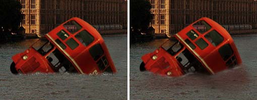
Another smash-up from Lexus, with some great detailing: the torn-off poster, the couple of smashed windows, the skewed number plate, and some very fine grubbiness altogether. Best parts: the removal of the front wheel (great axle there!) and the rusted-away bottom of the bus side. Slight perspective problem here, though: the white stripe gives us an indication of the horizon line, but the background view shows it to be much higher. I'll talk about this again later on! Then, of course, we get the inevitable diatribe over whether this is, in fact, a Routemaster or some other breed of bus. Well, yes, I've had this before - when I used the same bus for an illustration on the front of The Guardian, and a load of bus spotters wrote in to complain it was the wrong model. Hell, a bus is a bus is a bus, right? But point taken. A charming second entry from kenney, who's done a great job stuffing the bus with all the Forum regulars - at least, those of you who have supplied avatars (and come on, all the others - we want to see what you look like). Maiden's driving, of course, and I like the inclusion of our statue man from last week on the upper deck. but that reckelss fellow hanging off the back platform is precisely the reason why these buses were considered too dangerous for everyday use! Dek_101 has talked about spell checkers, and Paul 2005 has referred to the image. But where is it? Has th post been deleted? Top marks to G E Sutton, not least for turning the bus into a painting by one of my favourite artists. Nighthawks at the bus shelter, eh? But it's a great piece of work, with perfect perspectives and a fine set of reflections on the upper deck. I particularly like the way we can see the interior right the way through the windows on the lower floor - and the US license plate is a great detail. Excellent work! Ah, there's Dek_101's post - obviously been pulled and replaced with a new version. A good graphic interpretation, and I do like the Concorde and BA tailplane in there. Good choice of font, as well - Stencil does the job perfectly. Top marks! A fantastic tropical setting from pixelmonkey, with perfect recolouring and many great details - the bartender leaning over the side, the raffia canopy, the bottle on the front, and above all the way the bus is beautifully buried in the sand. And, of course, those all important reflections on the windows (you know I'm a real sucker for decent reflections). Beautiful! A great composition in mguyer's shot of the bus in the US - it fits the perspective, although perhaps it's a little skinnier than our UK version. Really, you should distort both sides of the by=us independently - not too difficult, it's basically a box. Is that you, Martin, both photographing the bus and driving it? Whaler has given us an interesting morph of the bus into a mini, that almost works. Need to address the masking, here: we can see too much of the front of the bus still, which makes the effect less convincing. In a case like this, I'd be tempted to make the top of the mini red as well, which would avoid that awkward transition. And cut out all the background from the mini first! Second entry is much more dramatic, with a real sense of movement. I really like this one! More destruction, this time from DaltonX. It's really interesting to see so many variations on the smashed up theme, and this one has some very good touches: the ripped poster drooping off, the smashed front window, the engine visible where the cover is bending off, the flat tyre (tire, US) and the couple of skeletons. And a splendid, ghostly background that really sets the whole thing off. Great job! A wonderful entry from maiden - I can believe the trouble you went to to cut out all those railings! But there you are, driving the bus, and the bronze version on the plinth is gorgeous. In particular, the plaque on teh front of the plinth is a fantastic piece of work, it looks entirely real. A thoroughly detailed, convincing montage, and you've even had a stab at last week's Challenge! Pauline's taken our bus to snowy territory, and the snow painted on it matches the real snow of the background perfectly. In particular, the way the snow wraps around the bottom of the bus is a great example of how to get the perspective right on these things. Desaturating the bus really helps it to look part of the scene, as well. Excellent work! Great to see the bus in a museum, and Eggbox has done the job perfectly. The reflection in the floor, and of the lights in the upper windows are excellent. The whole job has been done with great subtlety and skill, with a refreshingly different approach. Great work, Ted. I always like it when one entry sparks off another, and mguyer has taken Pauline's snow idea for his second entry. A good flurry of snow around the wheels, but shouldn't we see some snow on the roof as well? Or has it been kept in a garage overnight? A thoroughly retro refit from mr.pbody, with a 60s experience set, appropriately, in a poppy field. The images of Hendrix, Dylan and the other decorations are perfectly wrapped around the bus - but the shading all looks rather too flat to me. I'd really like to see some tonal change where the paint goes around the front corner, to give it a more 3D feel. And why is the edge of the paintwork so jagged? Looks like a dodgy Magic Wand selection to me. Use the Smooth tool to soften it out! A good idea from Slim - after all, bus jumping is a recognized sport. But there's a perspective problem here, which you really need to look at. That white stripe between the decks gives a strong indication of of how it should work: with all the buses lined up next to each other, the correct perspective should show a straight line through that white stripe, with the bottoms marked by a straight line though the clearly defined angle of the number plates: 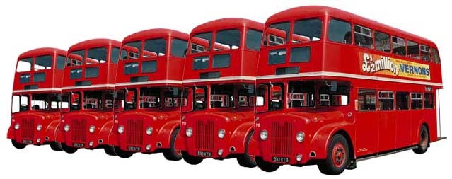
A tactile, if slightly baffling, entry from Tom this week. I love all the shiny stuff, but don't really get how the fly thing's working. Excellent degradation in the top right corner, though - displacement map? Or do you have a different technique? Hilarious turbo refit from Neal: this is going to be one speedy vehicle. But with all that space inside doubtless taken up by the huge engine, will there be any space left for passengers? Second entry from Born2Run gives us a stretch limo version of the bus - and wow, this one's really stretched! Perfect perspective, though, a great technical achievement. Who's Siegfried, though? The only one I can think of is the tutonic hero of Wagner's ring cycle, and somehow i don't think he'd go down well in Las Vegas. Paul 2005's 260 to Barnet is well and truly lost in Egypt. On the face of it, this is a simple montage - but look at all those added passengers! They're all perfectly fitted inside the bus, and look as if they've really been photographed there. Fantastic! Some tyre tracks in the sand would have really completed this one. There's that perspective problem again: the fact that the white stripe points downwards both sides from the corner means that we're looking up at the bus: those lines both point to the horizon. your background's too high! Another smash-up job from chris, with our bus looking distinctly the worse for wear on the scrap heap. I like all the rust, and the detail of the light hanging out by its wires, but the whole bus looks like it's fading away rather. Is this to match the background? Perhaps upping the contrast there, instead, would have helped! Neat rusty hubcaps, though. Aaaargh! The Partridge Family! Yes, jwhite, we do remember them, although many of us had done our best to forget. A lovingly repainted bus, beautifully decorated. Just a couple of things here: the family themselves are far too saturated for this image (just use Hue/Saturation to knock them back a bit) and the shadow behind the bus surely shouldn't appear on the sky as well? Layer Styles have their place, but I'm afraid this isn't the best application for them. Much easier just to paint this shadow in by hand! Stunning work from everyone this week. Thanks for putting the effort in! |
Posted on 27/01/06 12:27:36 PM |
|
stefan
Detail Demon Posts: 401 Reply |
Re: Contest 80: Bye bye, beautiful bus
Thanks verry much Steve for that advice on the waterline. I thought I was being clever by adding a bit of foam with a brush but making the waterline follow the contours of the bus makes it of course so much better. |
Posted on 27/01/06 12:54:37 PM |
|
Slim
* Posts: 29 Reply |
Re: Contest 80: Bye bye, beautiful bus
Steve, thanks for the advice on the perspective problem, i knew there was something obviously wrong with it, but you know how it is, the harder you look the less you see, thats why i like this forum so much, so many people willing to help out, once again thanks. |
Posted on 27/01/06 2:50:51 PM |
|
mr.pbody
*** Posts: 138 Reply |
Re: Contest 80: Bye bye, beautiful bus
steve, this new advice/critique section is great...i know you are busy but this really helps us in a very personalized way! keep up the great work! |
Posted on 27/01/06 4:06:14 PM |
|
Tom
Texture Technologist Posts: 405 Reply |
Re: Contest 80: Bye bye, beautiful bus
Hi Steve. No point to the flies. Just a lovely design element. The distortion is the smudge tool, hard brush,100%. |
Posted on 27/01/06 4:32:13 PM |
|
Steve Caplin
Administrator Posts: 7187 Reply |
Re: Contest 80: Bye bye, beautiful bus
I've always done a round-up at the end of the Friday Challenge, Mr P. It's only occasionally that I feel a visual example is needed, though, as in the couple of cases this week. I'm glad everyone seems to take my closing remarks as constructive comments, rather than criticism. I know I spend some time talking about where illustrations have gone wrong, but I think this is the best approach to take. And as for being busy - well, this forum is one of the things I'm busy with. It's just great to see so many people taking part. |
Posted on 27/01/06 5:05:12 PM |
|
pauline
Centenary Challenger Posts: 213 Reply  |
Re: Contest 80: Bye bye, beautiful bus
Steve, I for one look forward to Friday to see how I did! It's wonderful of you to do this as it really does help us to get better. Your constructive comments are most welcome. I printed out your comments today and look at each entry as I read it. It was so helpful to be able see what you are talking about and I think it is also useful to see where others went wrong which will in turn broaden my knowledge. I'm busy working away on this weeks challenge, and so far I'm pretty pleased with the results. Need to step away for lunch and to walk the dog and then look at it again with fresh eyes! Can't wait until next Friday!!  _________________ Pauline |
| page: 1 2 3 4 last |